My Fonts Look Crap. I blame Windows and ATI.
I know, I know. But I use Windows for 8 hours a day at work. So what do you do?
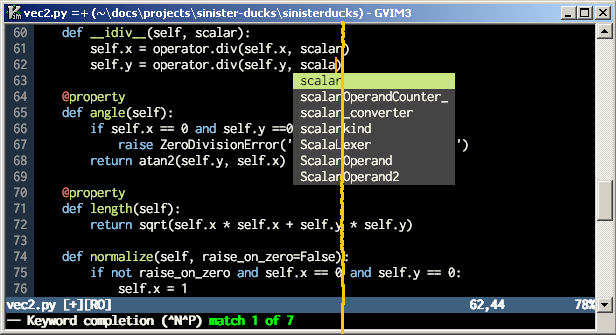
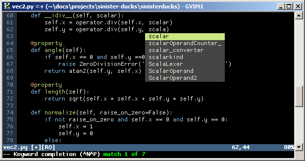
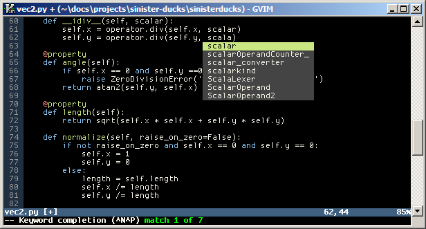
Here's the poster-boy for programmer-friendly fonts, your friend and mine, everyone loves him, Inconsolata:
I don't know about you, but to me that looks unutterably crap. Wonky and irregular. On the right of the orange line is what it looks like with ClearType turned off. Meh. Presumably I'm doing it wrong, somehow, but unless I figure out how, Inconsolata can fuck right off.
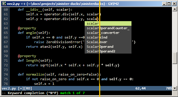
So then I fire up the trusty fallback, Consolas:
This is better, certainly, but the letters look cramped. For the number of visible lines in a window that size, the letters are awful small. Again, on the right of the line is ClearType turned off - which in this case distinctly worse.
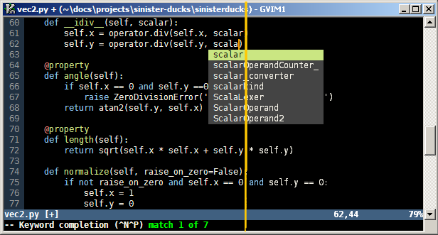
So I continue peering at a succession of monospaced idiocy, eventually ending up on DejaVu Sans Mono:
This still isn't perfect, but it's the best I can find. Note that it bears out my impression of Consolas being cramped - even though the letters are substantially larger, we still manage to fit an extra line of text in. This time, turning ClearType off (right of the line) makes it a little crisper, and a little more wonky, but not much.
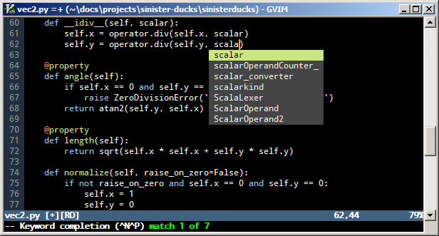
This isn't just in Vim. It looks like this in all applications. I've tried running the ClearType Tuning Powertool, to no avail. Admittedly, all these fonts start to look a damn sight better when I increase the size a few notches. But that's bugger all use really, isn't it? Maybe I should be digging out some mono fonts designed especially to be viewed at small sizes? Oooh, now that's actually not a bad idea: How about those Android fonts everyone's banging on about? Droid Sans Mono:
This isn't bad, but does contain all the old 'zero vs upper-case O' and 'one versus lower-case L' ambiguities. I think I'll stick with DejaVu Sans Mono.
Does Inconsolata work OK on Windows for everyone else?
Update: Gerry suggested trying out Proggy Fonts (thanks!). These are bitmap fonts (unless you want to do without extended characters) so they won't scale. Nevertheless, here's how some representative fonts from there look. First up, Proggy Clean slashed zero:
I love the crisp clarity of a pixel-perfect bitmap font with no scaling or anti-aliasing. On the downside, I have a feeling that the characters' shapes aren't quite as well-formed and beautiful as DejaVu. Not sure whether or not this would bug me. Next up, Proggy Opti:
Color me impressed. Opti still has the wonderful pixel-perfect clarity of Proggy Clean, and manages to fit four extra lines of text into the same sized window. Obviously in order to achieve this, the characters are smaller than Deja Vu, but this is no bad thing. I would have liked to scale Deja Vu down a tad from the size you see it above, but if I try, the letters start to become a little distorted and indistinct. I might well give Opti a spin for a few days, see how it wears on me. Thanks for the suggestion Gerry!
Update: Nowadays I use Dina, a monospaced bitmap font created by some obsessive with a penchant for microscopic fonts. It's absolutely perfect.
